You can follow the Step-by-step guide from Chart.js, learn how to create a chart from scratch, and explore all the fundamental concepts of Chart.js, including chart types, elements, datasets, customization, plugins, components, and tree-shaking.
Create a new project
The first step is to create a project with this folder structure:
app
├── package.json
└── src/
	├── index.html
	└── draw.js
The official tutorial uses Parcel as its build tool, so we’ll install Chart.js v4 and Parcel in our package.json.
{
  "name": "chartjs-example",
  "version": "1.0.0",
  "license": "MIT",
  "scripts": {
    "dev": "parcel src/index.html",
    "build": "parcel build src/index.html"
  },
  "devDependencies": {
    "parcel": "^2.6.2",
    "prettier": "latest"
  },
  "dependencies": {
    "chart.js": "^4.0.0"
  }
}
After creating package.json, we can execute an installation command, such as npm install or the equivalent command from other package managers. Next, we can create a src folder and place an index.html file inside it.
<!doctype html>
<html lang="en">
  <head>
    <title>Chart.js example</title>
  </head>
  <body>
    <div style="width: 800px"><canvas id="draw"></canvas></div>
    <script type="module" src="draw.js"></script>
  </body>
</html>
Ideally, Chart.js helps us draw the chart inside a canvas element with an id while also ensuring the chart’s responsiveness. This is why we create a div with an 800px width around the canvas.
Draw the chart
Drawing a chart is very easy, thanks to the simplicity of the APIs in Chart.js v4. The code below accomplishes the following tasks:
- We import
Chartfromchart.js/auto, which loads all available Chart.js components but disallow tree-shaking (convenient for development). - We initialize a
Chartinstance by providing two arguments: the first one is the canvas element, and the second one is the options object. - To create a basic demonstration, we only need to specify the chart type (
bar) and provide data. The data includes labels and an array of datasets (Chart.js supports multiple datasets for most chart types). Each dataset is assigned a label and contains an array of data points.
import Chart from "chart.js/auto";
(async function () {
const data = [
{ year: 2010, count: 10 },
{ year: 2011, count: 20 },
{ year: 2012, count: 15 },
{ year: 2013, count: 25 },
{ year: 2014, count: 22 },
{ year: 2015, count: 30 },
{ year: 2016, count: 28 },
];
new Chart(document.getElementById("draw"), {
type: "bar",
data: {
labels: data.map((row) => row.year),
datasets: [
{
label: "Count by year",
data: data.map((row) => row.count),
},
],
},
});
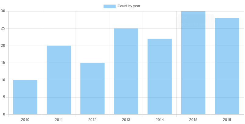
})();Now, you can run the example by using npm run dev and view the result at localhost:1234, which should look something like this:
Multiple datasets and more options
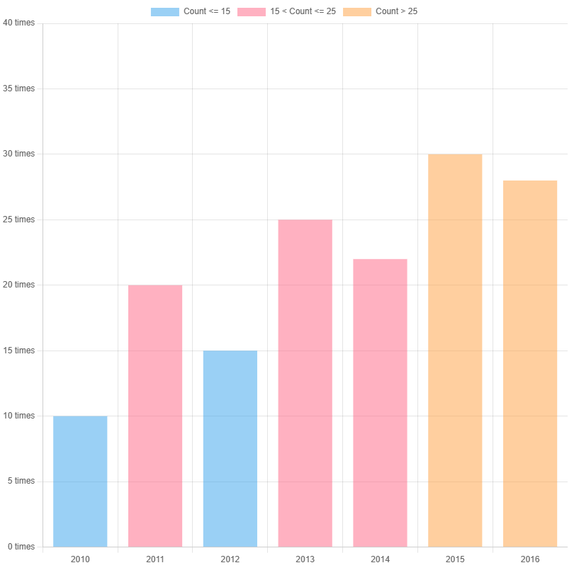
Let’s apply further customization to our bar chart. For instance, I want to categorize the dataset into three parts: values less than or equal to 15, values between 15 and 25, and values bigger than 25. Each part will be assigned a distinct color.
(async function () {
  new Chart(document.getElementById("draw"), {
    type: "bar",
    options: {
      aspectRatio: 1,
      scales: {
        x: { stacked: true },
        y: { max: 40, ticks: { callback: (value) => `${value} times` } },
      },
    },
    data: {
      labels: data.map((row) => row.year),
      datasets: [
        {
          label: "Count <= 15",
          data: data.map((row) => (row.count <= 15 ? row.count : 0)),
        },
        {
          label: "15 < Count <= 25",
          data: data.map((row) =>
            15 < row.count && row.count <= 25 ? row.count : 0,
          ),
        },
        {
          label: "Count > 25",
          data: data.map((row) =>
            row.count > 25 ? row.count : 0,
          ),
        },
      ],
    },
  });
})();
You can discover other options that you can fine-tune in the options object, such as aspect ratio, maximum or minimum values for the x and y scales, and custom tick formatting.
References