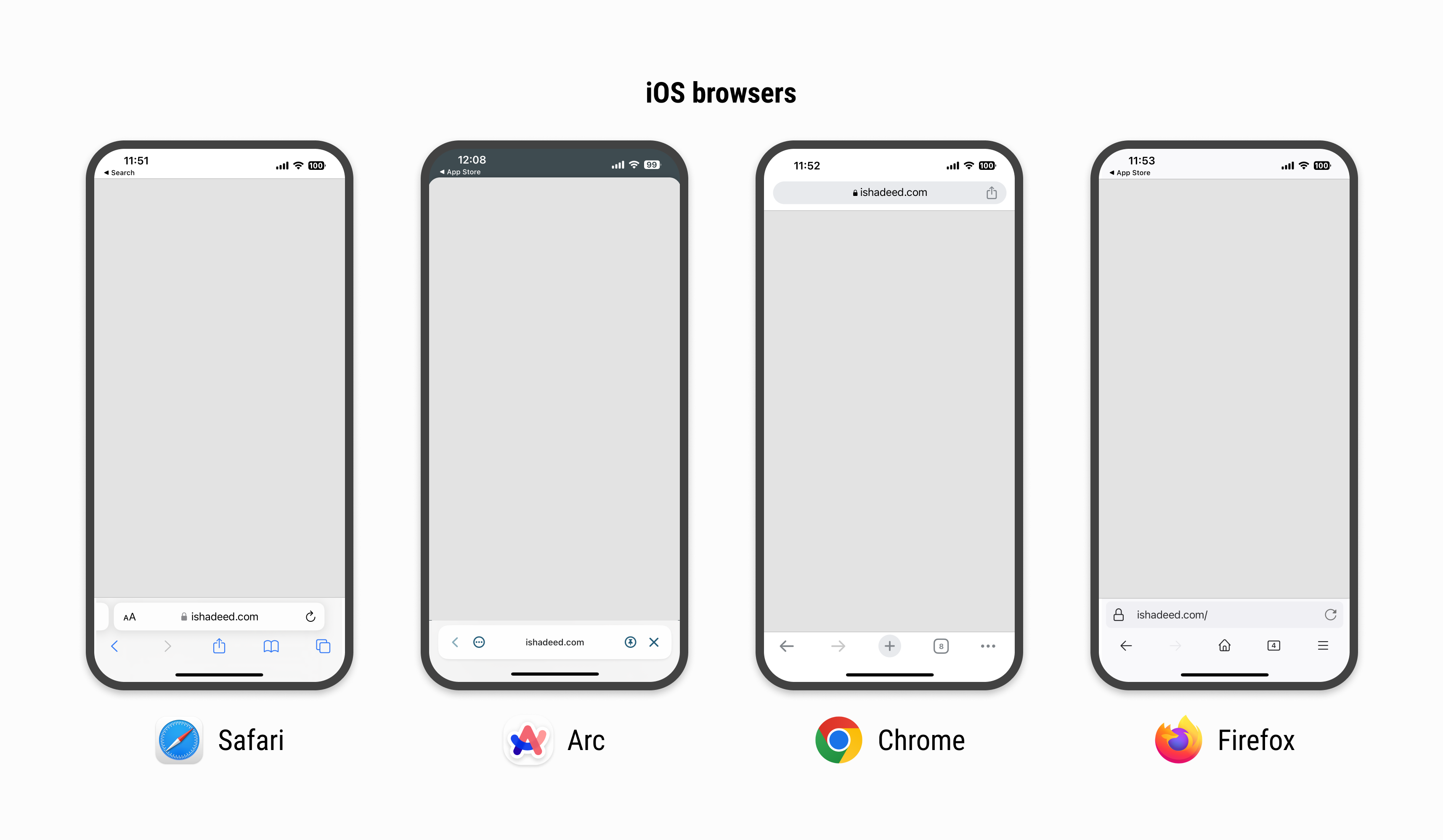
We often use 100vh to design the interface for full height, depending on the user’s device, whether it’s a PC or a smartphone. But 100vh does not always work on a smartphone because smartphone browsers may have an additional header with varying heights.

Image source: New Viewport Units (ishadeed.com)
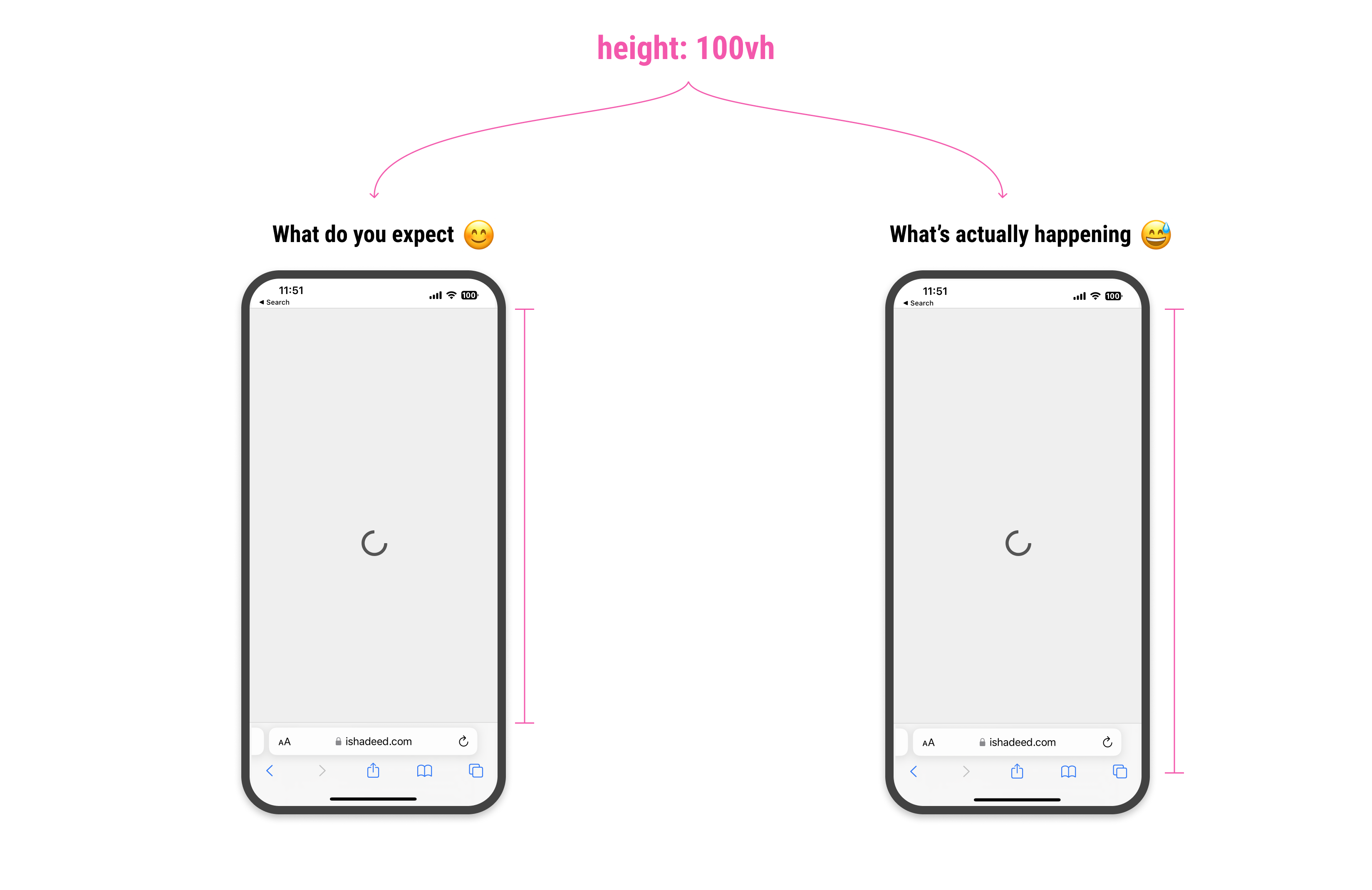
For example, when we want to center an element on the screen using 100vh, the CSS will not subtract the height of an additional header; instead, it will ignore the header’s height.

Image source: New Viewport Units (ishadeed.com)
Mobile Viewport Units
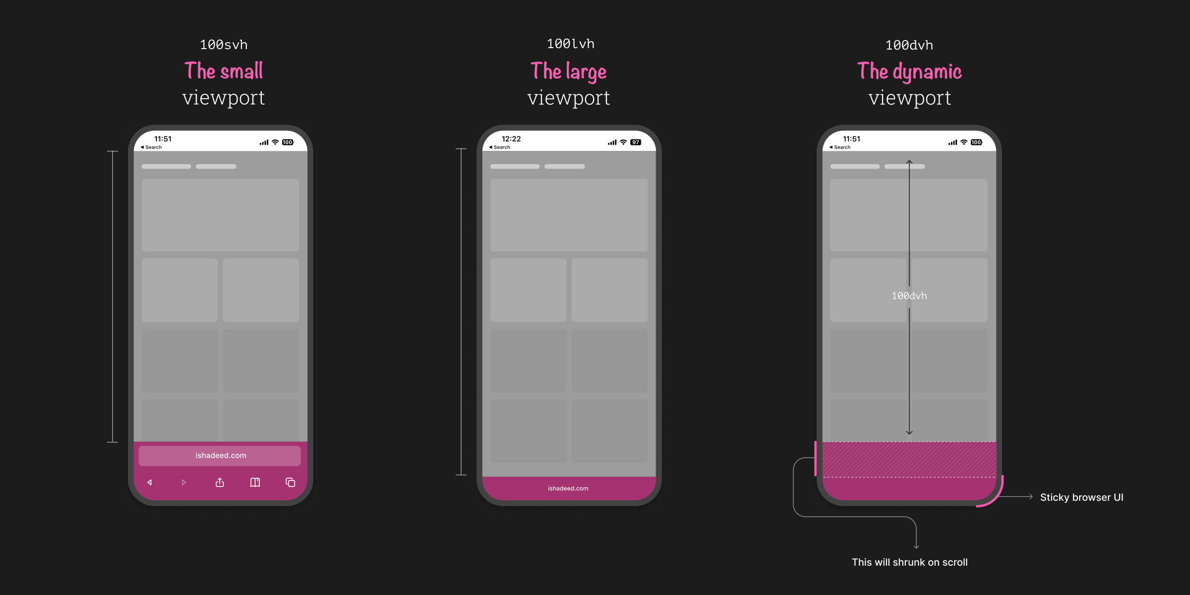
To solve the problem, the CSS team created three additional viewport units, namely svh, lvh, and dvh. They stand for small, large, and dynamic viewport height, respectively.
svhis the viewport height when the browser’s address bar is fully expanded.lvhis the viewport height when the browser’s address bar is shrunk.dvhis the viewport height automatically subtracted by the browser’s address bar’s height, whether it is expanded or shrunk.

Image source: New Viewport Units (ishadeed.com)
So, why don’t we just use dvh for all situations? Because there are two important things we need to keep in mind when using dvh.
First, the use of dvh might affect the performance of your page because the CSS needs to calculate the dynamic height whenever the user scrolls on your page.
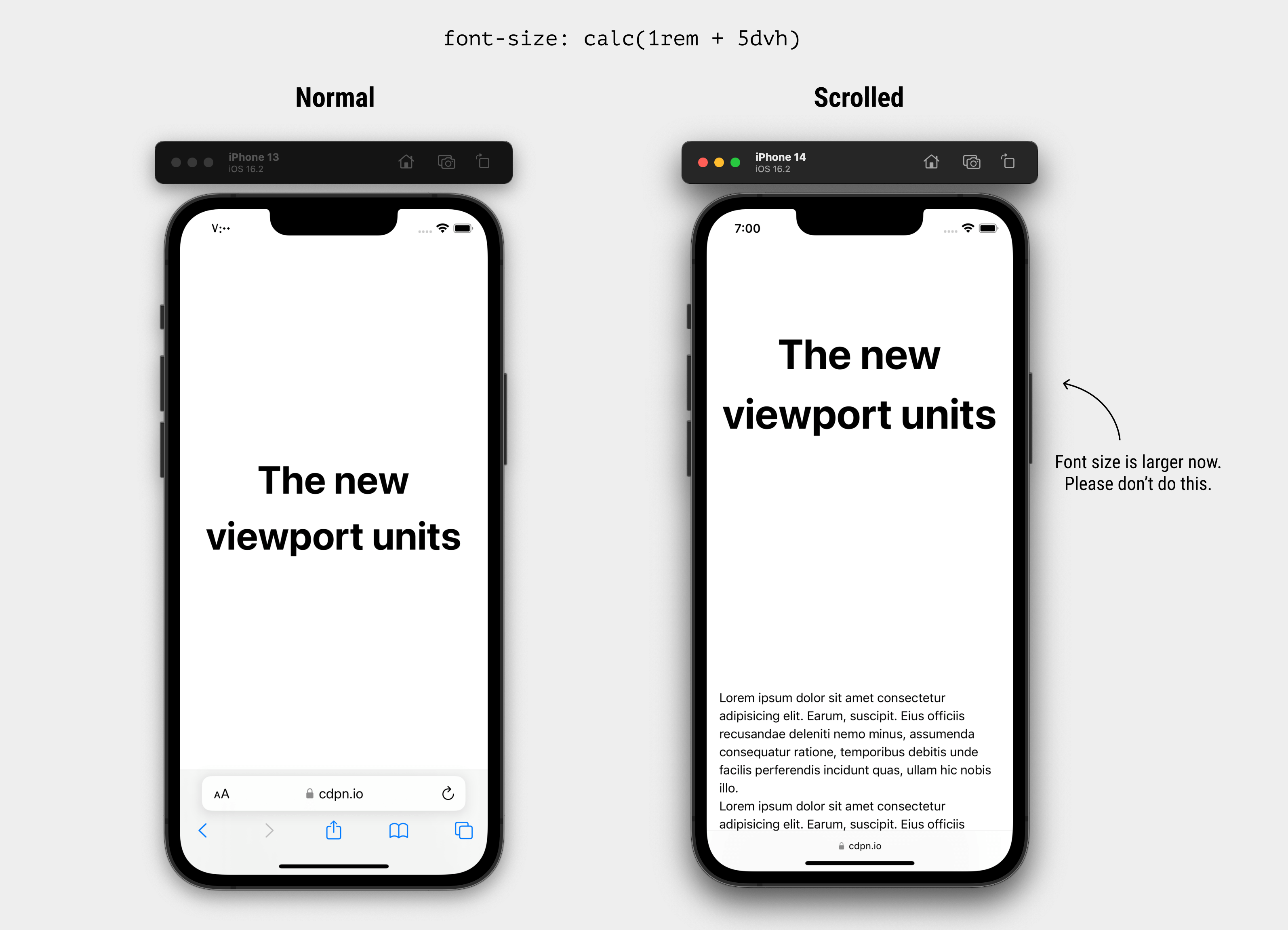
Second, the value of dvh will change as you scroll and the address bar’s behavior changes. For example, you might set the font size to correspond with dvh, and this will cause the font size to change as the user scrolls.

Image source: New Viewport Units (ishadeed.com)
References